Content and imagery has been modified, obscured or omitted to comply with NDA's.
Product Management Software
With thousands of affiliates across the US and Europe this healthcare supplier needed a more efficient system to manage their massive product offerings. Our client had 25 internal applications many of which were built on different platforms by different people. In addition to the logistical challenges of managing that many individual applications; the user experiences were profoundly different. We were tasked with the design of an all new product that would combine three of the existing applications into a unified solution.
my role
Responsible for crafting a design that would drive smarter and faster purchasing through a new, intuitive, and data informed user centered design.
Ultimately gaining executive buy in, reduce costs, and combine multiple systems into a single application.
Responsible for leading the design process, design architecture, and prototyping. Shared responsibility evaluating documentation for three existing solutions, timing and budget management.
the challenges
massive documentation
One of the largest challenges we faced while designing the new system was understanding what all the existing systems did and why.
It was critical for us to understand why the systems were operating like they were so we could truly redesign the experience. We didn’t want to just take their existing process and modernize it. It was our goal to dig deeper than the documentation and truly understand what tasks users were completing so we could make informed design decisions.
We were provided with extensive documentation on each system. Carefully reviewing and dissecting these documents to understand how the users were currently utilizing them and how we could ultimately tie them all together was quite the challenge. Staying connected while reviewing hundreds of pages of documentation can be very cumbersome, however the deeper understanding was crucial. This allowed us to discover important details that the client can’t always remember.
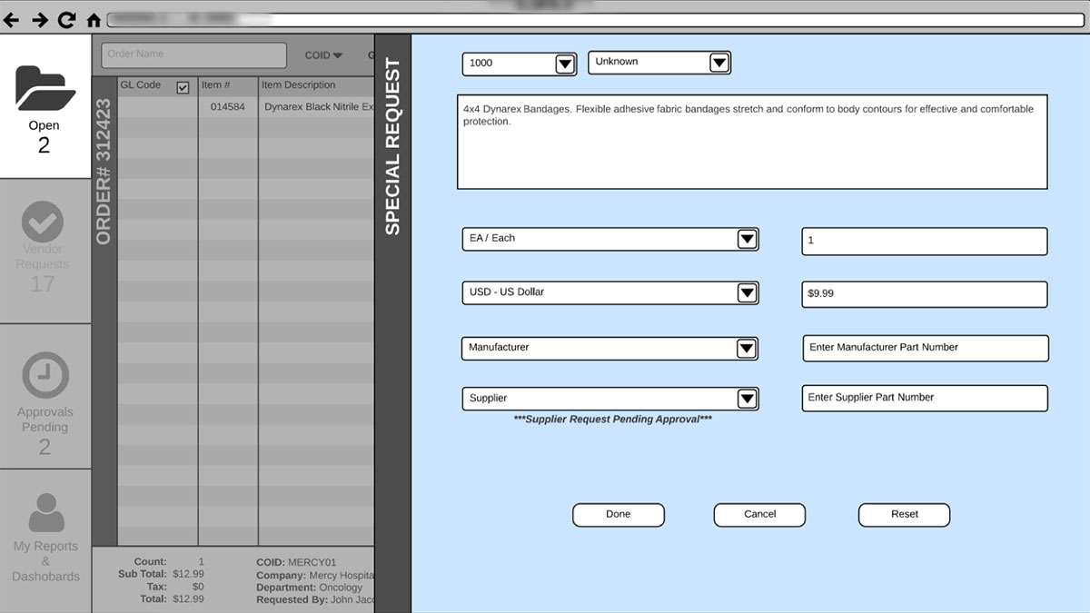
For example we were able to deeply understand the process of what users needed to provide when they wanted to utilize a vendor that wasn’t already in the system.
Wireframe of the "Add Vendor" experience. Without a deep dive into their process flow we wouldn't have been able to account for all the details that goes into this flow.
Surfacing data
Surfacing data was a critical pain point. Many affiliates were ordering products that weren't “on contract” which resulted in massive over charges and cost the company millions of dollars annually.
Keeping it familiar for users
These systems were a couple decades old but over the years people became accustomed to using them no matter how bad the experience was. Something we wanted to be very cognizant about was modernizing the way people used the application but in a way that was familiar to them. A core example of this is maintaining the 10-key user experience.
company politics
As a consultant I have found that it is very common to work with organizations with varying degree of internal conflict whether it be with key decision makers or interdepartmental differences. This project proved to be no different. There were some power struggles throughout the organization between two departments. When we were brought onto the project we became the voice of reason and a mitigator of sorts which helped mend the fractured relationships.
the approach
understand the systems quickly
Really grasping what all the applications did and how they could all come together was really the crux of the project. We took the time necessary to truly understand what it was the applications did and why. By the end we had defined three main processes we needed combined into one system:
- Approval Process
- 10-Key Ordering Process
- Hybrid Ordering Process
Understanding the users

10-Key
This user is a data entry master. They spend time in the system for one reason and that is to quickly and efficiently process orders. The need to access other areas or search within the system is rare.

Hybrid
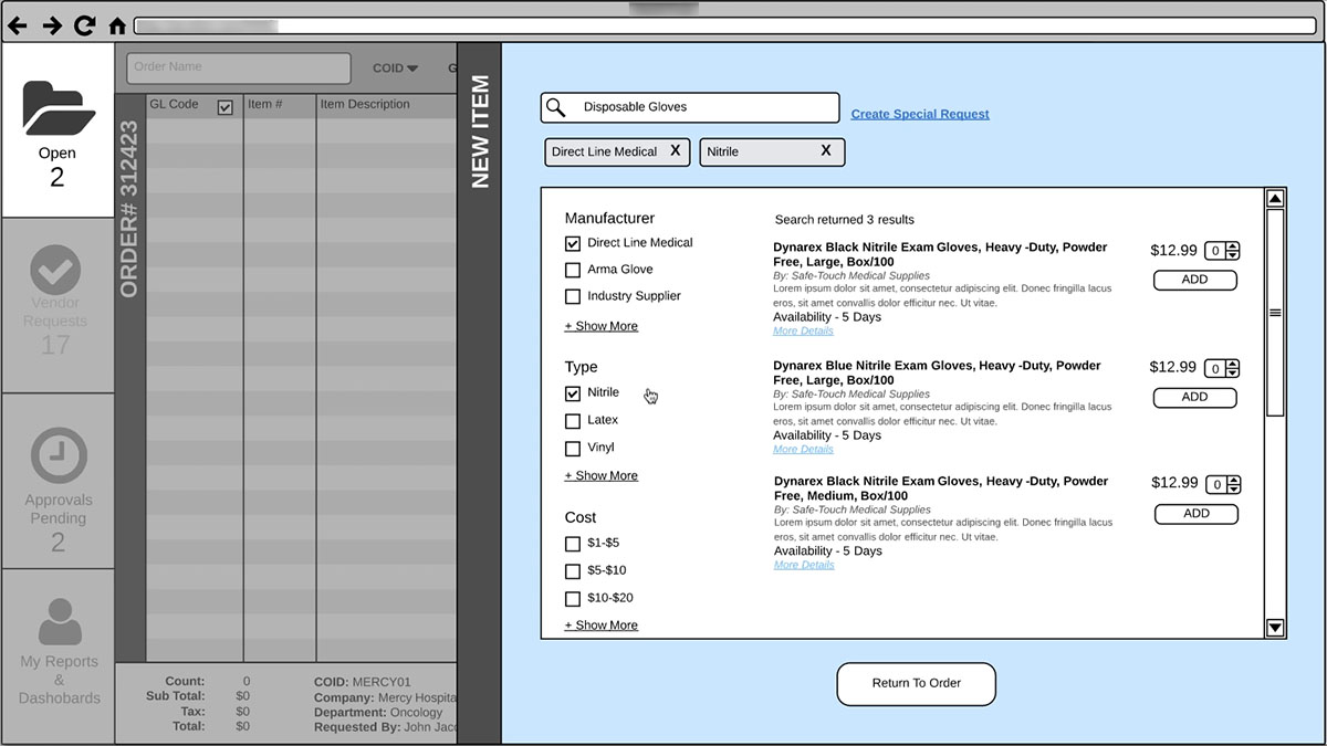
The hybrid user is someone who needs to be able to complete tasks both with the 10-Key as well as the keyboard and mouse. This user benefits from in-line searching, hover tips, and needs to be able to view multiple products simultaneously to make an informed ordering decision.

Approver
The approver is someone who needs a quick overview of the orders to be able to make decisions quickly and easily. Yet they may at times need to get the whole picture and see the entire details. No matter where they are, they should be able to easily make a decision.
the process
Working with a business analyst, architect, and developer we started the process of designing, architecting, and defining how the product would come together.
Taking a user centered design approach we began flushing out ideas of how we would integrate the the three process flows into a single application.
defining Purpose
On a high level we defined what the process would achieve for each user.
10-Key User
When I need to place high volume orders or search for items I can’t remember, I want to mainly use the number pad on my keyboard to enter items, so I can quickly and efficiently move through orders.
Hybrid User
When I need to place orders or find items, I want a shopping experience where I can search and filter through products, so I can see what is available, what my options are and easily add them to my order.
Approver
When my team submits orders, I want to be able to quickly review, approve or reject orders, so I can provide prompt customer care to our affiliates.
Patterns
Starting with the two ordering processes, we first identified which parts were similar in each flow. We wanted to see how much overlap was existing so we could then evaluate if there is a way to combine these processes into the new solution.
For example, if a 10-Key user needs to search for a product should that experience be the same as a Hybrid user? Conventionally it is common to keep experiences consistent throughout programs, but since we dug deeper to understand how these users are interacting with the product it didn’t make sense.
If a 10-key user were forced to use the same search functionality as the Hybrid user it would cause them to exit their workflow, they would have to shift mental modalities in order to find products. This would decrease productivity for the user and efficiency within the system.
We determined that both users needed to be able to search for products but required their own experience.
10-Key User: This search functionality was built for speed. It's not uncommon for users to know the beginning few digits of a product. By simply typing in what they know, the most common products are presented inline.
Hybrid User: This user gets a far more robust experience which includes filtering, viewing additional details and adding items to their order.
WHY
I believe that asking and knowing why is such a crucial component to UX design. It defines motivations, it unearths reasons you wont get just from the surface, and it adds deeper value and meaning to products.
For example: Our client wanted visibility into who and what items are being ordered off contract. A simple approach would have been to surface this data to managers in a report each week. But digging deeper into the problem we discovered that while it’s important for managers to have this visibility we can save the company time, money, and increase productivity by making this data visible to everyone. The person ordering, the person approving, and the manager.
By digging a little deeper we were able to identify the problem wasn’t that managers didn’t know what items were off contract, it was that no one knew. We deeply integrated the visibility of “off contract items” into the interface at all levels so that there would be zero questions from all roles if an item were off contract.
Application provides real time notifications of items off contract.
Approvers now have great visibility into off contract items.
Delivery
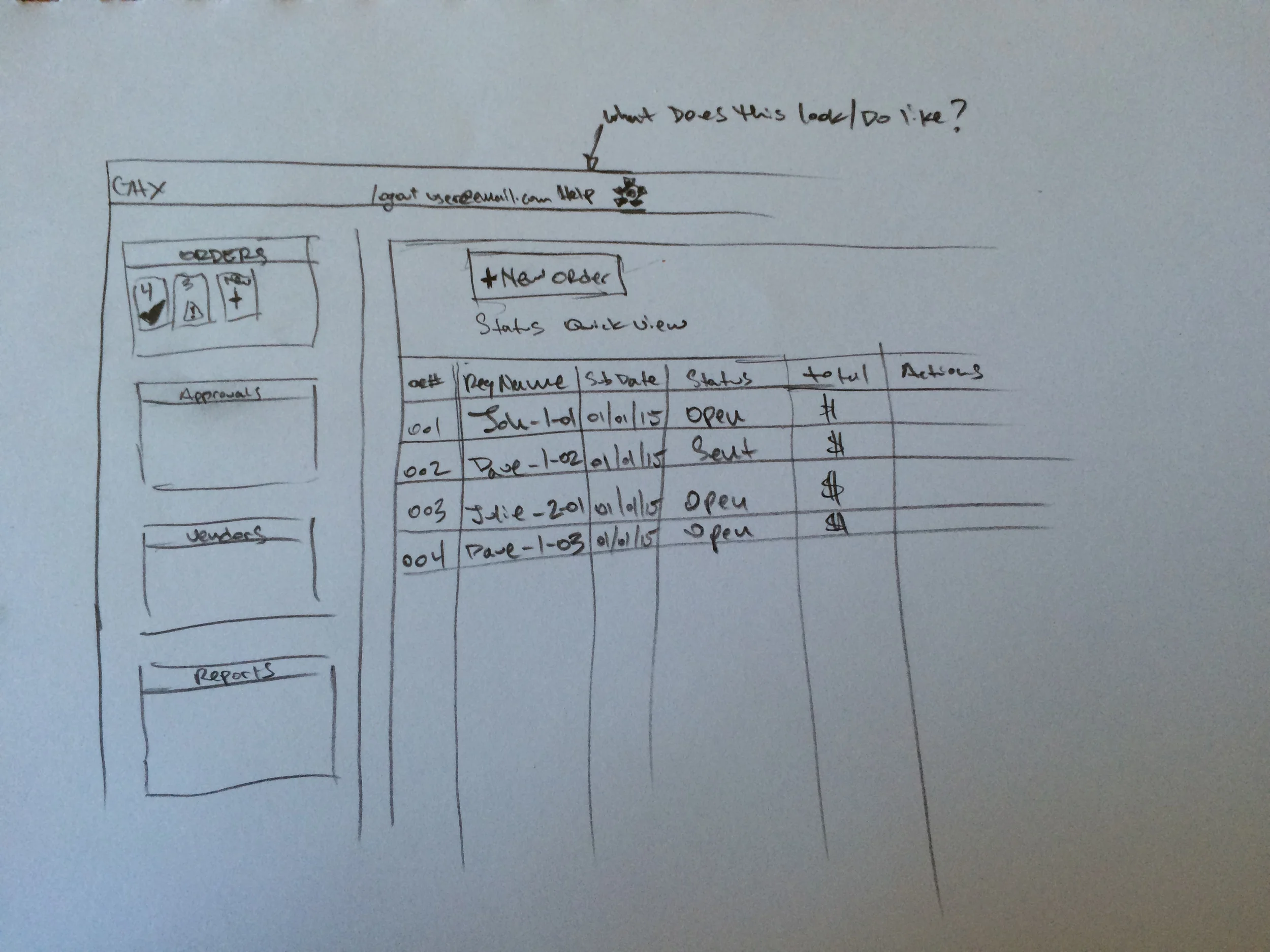
Starting with sketching, moving into paper prototypes and eventually ending with a clickable prototype we carefully thought through each process flow answering questions and finding solutions to business problems while designing for the user.
Paper prototyping from the onset really helped quickly iterate through concepts without feeling to attached. We were able to share ideas with our client and quickly receive feedback.
Utilizing LucidCharts we produced a clickable proof of concept prototype for each process flow from beginning to end.
Paper Prototype




Digital Prototype




Impact
Upon review of our final deliverables, our client was thrilled and excited with the work we produced. His team was able to immediately begin development and said that within 3 months of receiving our designs that his team was able to complete more work than they had for a full year.
